Victor Hammer never lived in Louisville, and as far as the record shows he visited only a handful of times. But the Austrian-born typographer designed the seal the city carried on its letterhead, its police badges, and its flag for half a century — three fleur-de-lis in a triangle that outlasted him by decades before Louisville and Jefferson County merged governments in 2003 and retired it.
A Vienna Apprenticeship
Hammer was born in Vienna on December 9, 1882, the son of Karl and Maria Hammer. At fifteen he apprenticed in the studio of architect and urban theorist Camillo Sitte, then transferred in 1898 to the Academy of Fine Arts Vienna, where he trained for a decade in painting and sculpture. He won the Prix de Rome in 1909, already showing the instinct for classical letterforms that would define his life’s work.
Florence and the Wooden Press
In 1921, Hammer cut his first typeface: an uncial letterform he had been drawing by hand with broad pens since before World War I, a deliberate throwback to the rounded scribal hand used in late antiquity, which he believed read faster than the elongated ascenders and descenders of standard roman type. The Gebr. Klingspor foundry in Germany published it as the Hammerschrift in 1923.
The following year Hammer moved to Florence and set up his own press, building a wooden press by hand in 1927 with local craftsmen, copied after one he had studied at the Laurentian Library. (Decades later, in 1960, that library’s own press turned out to be an 1818 copy of an older original — Hammer, without knowing it, had reproduced a reproduction.) In 1929 he moved the operation into the Villa Santuccio and named it the Stamperia del Santuccio. Its first book, printed in 1931, was Milton’s Samson Agonistes, set in a new uncial Hammer called Samson, its steel punches cut by Paul Koch, son of the well-known German type designer Rudolf Koch.
Koch had watched Hammer work for years, and once told him something that captured the difference between the two men’s careers.
“You are fortunate, Victor, that you are an outsider and not a professional. I cannot do what you do. I must meet the demands of our customers, and sometimes those of the market.”
— Rudolf Koch, to Victor Hammer
Fleeing to America
Hammer moved his practice to Kolbsheim, in Alsace, in 1934, and from 1936 to 1939 taught at Vienna’s Akademie der Bildenden Künste. When Germany annexed Austria, he fled the Nazis in 1939, arriving in the United States with almost nothing — his casting and cutting tools, along with most of his fonts, stayed behind in Europe.
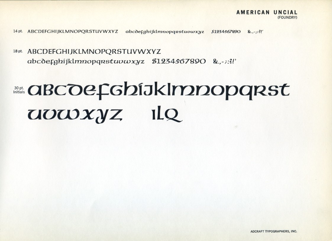
He rebuilt in Aurora, New York, teaching at Wells College until 1948. It was there that he produced the design that would outlive all his others: American Uncial, cut in 1943 and eventually the best known of his five typefaces. The Gebr. Klingspor foundry began selling it commercially in Germany, under the name Neue Hammer-Unziale, starting in 1953.
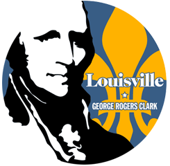
Louisville’s Seal
In 1948, Hammer settled for good in Lexington, Kentucky, as artist-in-residence at Transylvania University, a post he held until his retirement in 1953. It was from there that Louisville came calling. Mayor Charles Farnsley — already known at city hall for his enthusiasms, from founding the city’s arts fund to prying loose a Rockefeller grant for the Louisville Orchestra — wanted a simpler official seal to replace the ornate, locomotive-and-progress design the city had carried since 1910, and the commission went to Hammer.
Hammer’s design, adopted by the city council on November 25, 1953, reduced Louisville’s crest to three fleur-de-lis arranged in a triangle — one flower for each century of the city’s history — ringed by thirteen stars for the original states and the year 1778, marking the first settlement at the Falls of the Ohio. The fleur-de-lis itself was a quiet nod to the source of the city’s name: it was the emblem of King Louis XVI of France, honored by Louisville’s founders in 1780. Around the same years, Hammer designed a second Kentucky civic emblem, the University of Louisville’s seal, a portrait of Minerva the university has used, with revisions, ever since.
Hammer’s seal stayed on Louisville’s letterhead, badges, and flag for exactly fifty years, until the city and Jefferson County merged governments on January 6, 2003, and adopted a new joint seal designed by Louisville native William Glenn Hack.
A Kentucky Legacy
Hammer kept working in Lexington for the rest of his life. In 1955 he married Carolyn Reading, who a year later founded the King Library Press at the University of Kentucky; his own hand-built wooden press, retired since Florence, was moved there in 1954 and has been in continuous use since 1959. He was a close friend of the Trappist monk and writer Thomas Merton, and hand-printed the first edition of Merton’s The Wisdom of the Desert.
Hammer died in Lexington on July 8, 1967, and is buried at Pisgah Presbyterian Church near Versailles, Kentucky. American Uncial outlived him by decades: Adobe and Linotype digitized it in 1988, and by the 1990s it had become one of the most reused typefaces in American design, gracing everything from book covers to, somewhat removed from Hammer’s original intent, anything meant to look vaguely Irish or Gaelic. More than forty years after Hammer’s death, his letterforms are more widely seen than they ever were in his lifetime — even if the triangle of fleur-de-lis he designed for Louisville’s own seal came down decades before that.
Sources and further reading
- Biographical details and career timeline — Wikipedia’s entry on Victor Hammer and the Hammer Society
- Seal history and adoption date — Wikipedia’s “Seal of Louisville, Kentucky,” citing The Encyclopedia of Louisville (John E. Kleber, ed., University Press of Kentucky, 2001)
- Read the reference — The Encyclopedia of Louisville (University Press of Kentucky)
- Typeface history and the Koch quotation — Dan Reynolds, “Victor Hammer and Punchcutting,” TypeOff.
- Farnsley’s mayoral record — prior Louisville.cc research, see 50 Mayors of Louisville